What “similar materials” means in real image searches
You take a photo of a countertop, a jacket fabric, or a brushed metal panel and type “find similar.” The first surprise is that “similar” can mean different things depending on the job: a spec match for ordering, a visual match for client approval, or a close-enough substitute for a repair where aging and wear matter.
Most image search tools are not identifying the material the way a lab would. They’re ranking images by visual cues the camera captured—pattern, grain, weave, reflectivity, and sometimes color. That’s useful, but it can fail when lighting shifts, glare hides texture, or scale is unclear. A quick verification step (dimensions, finish name, sample swatch) is still part of the workflow, and it costs time.
Decide what counts: texture, color, finish, or composition
Picture two oak floors: one is stained darker and shot under warm lamps, the other is natural and photographed in daylight. If your goal is “same product,” color is a weak signal; you care more about grain pattern, pore structure, and plank cut. For fabrics, it flips often: a plain weave in the right dye lot may matter more than the weave’s tiny texture differences, especially when the photo is slightly out of focus.
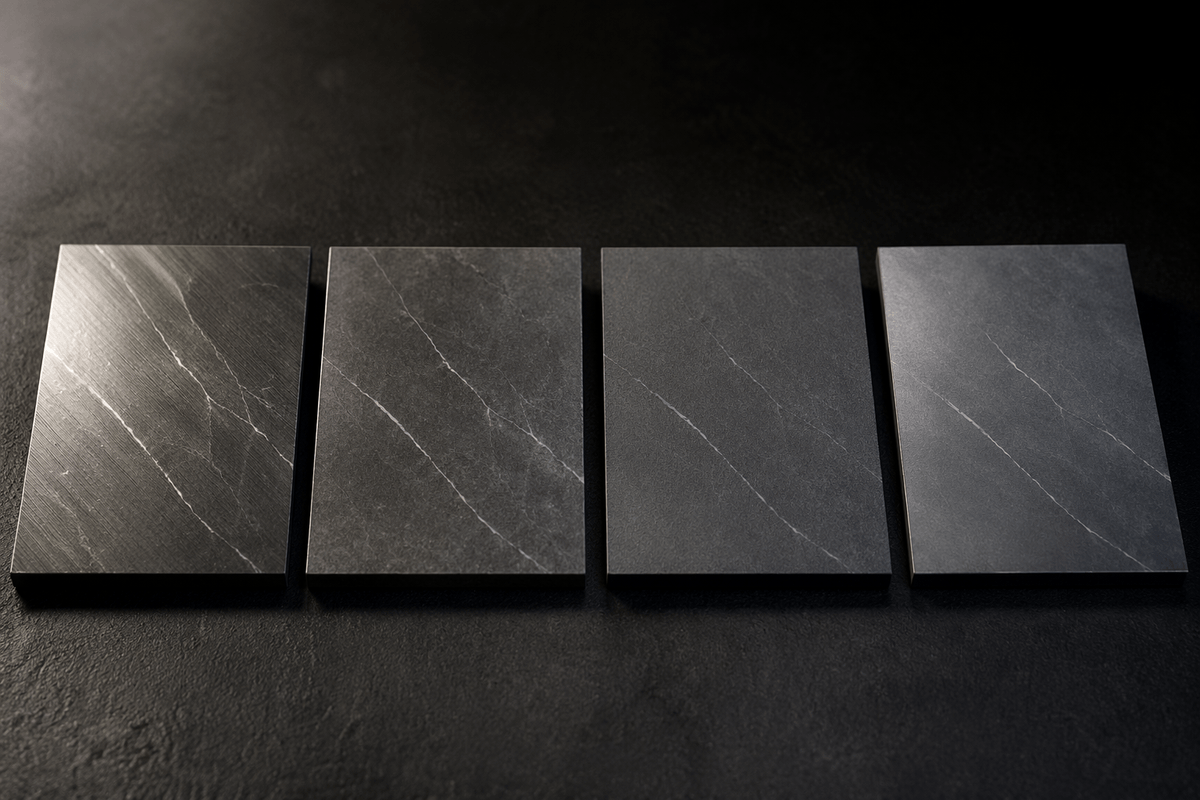
Brushed, honed, matte, and satin can look like different materials depending on angle, glare, and camera exposure, and a “good” match on texture can be wrong in reflectivity. Composition is even harder: ceramic that mimics marble can rank above real marble if you only score visuals. Choosing what counts up front is the only way to judge results fairly and avoid expensive sample churn.
Build the right reference set before choosing a model
A common failure pattern is blaming the model when the real problem is the reference set. If your catalog photos are clean studio shots but users upload angled, shadowy phone photos, your “best match” will often be the best-lit match, not the best material. The reference set needs to represent how surfaces look in the wild: multiple angles, distances, and lighting conditions, plus variants for wear, sealing, and staining when those change appearance.
Coverage matters more than cleverness. For each SKU or material family, aim for several crops that isolate the surface (not the room), and include close-ups that make scale obvious (coin, ruler, known tile size). You’ll also need negatives: near-duplicates you don’t want matched (similar granite colors, adjacent fabric weights). Creating and labeling this set costs time, and it’s rarely “one and done” as new finishes and photo styles enter the pipeline.
Compare approaches: hand-crafted features, deep embeddings, and CLIP
When people say “image similarity,” they’re usually mixing three families of methods. Hand-crafted features use explicit measurements like color histograms, edge direction, or texture descriptors (think “how often do dark/light transitions repeat?”). They’re fast, predictable, and can work well for controlled catalogs, but they break quickly with glare, shadows, or small changes in camera distance because the “measured” texture shifts.
Deep embeddings (a neural network that turns an image crop into a compact vector) usually handle messy phone photos better because they learn which visual cues matter across many examples. The trade-off is practical: you’ll need a decent reference set and periodic re-tuning, and results can be harder to explain when a match looks wrong for a human reason (scale, finish, context).
CLIP-style models add language alignment, which is handy when users also type “honed limestone” or “brushed nickel.” They’re strong for broad visual concepts, but for near-duplicate sourcing—two similar quartz patterns from different SKUs—generic CLIP often needs domain-specific re-ranking or it will favor “looks like” over “is the same.”
A practical pipeline: crop, normalize, embed, then retrieve
A workable pipeline starts by removing everything that is not the surface. Auto-detect a “material patch” (or let the user tap to crop), then generate a few tight crops at different scales so you capture both micro-texture (weave, pores, brushing) and macro pattern (veining, repeats). If the crop still includes grout lines, stitching, or a specular hotspot, treat it as a different query because those cues can dominate the embedding.
Normalize before embedding: resize consistently, clamp exposure, and apply light color correction so warm indoor photos don’t collapse into “brown.” You then embed each crop into the same vector space as your catalog images and run nearest-neighbor retrieval to get the top candidates. A practical constraint is cost and latency: embedding and searching multiple crops per query improves accuracy, but it increases compute, and on-device privacy-friendly pipelines may need smaller models.
Measure similarity with tests that match how users judge it
You can’t judge a similarity system with “top-1 accuracy” unless the task is truly “find the exact SKU.” Most material searches are “get me into the right neighborhood fast,” where the top 5–20 results matter more. Use rank-based metrics (top-k hit rate, mean reciprocal rank) and track them separately for “same product,” “same family,” and “acceptable substitute,” because those failure costs differ.
Build tests around human decisions. Create query photos that look like real jobs—angled phone shots, mixed lighting, worn edges—and ask reviewers to mark results as usable for their purpose. A useful pattern is pairwise judgments (“A or B is closer?”) because it’s faster and more consistent than absolute scoring. The reviewers need calibration, and you’ll need ongoing sampling as the catalog changes and new finishes enter the set.
Handle edge cases: glare, scale changes, and mixed materials
Real photos fail in predictable ways. Glare is the biggest: a specular highlight can erase grain and weave, and many models treat that bright patch as a “feature.” A practical fix is to detect clipped highlights and either mask them or down-weight that crop, then fall back to a second crop from a different spot on the surface. You can also prompt users with a simple capture rule: tilt the phone slightly and avoid direct light.
Scale changes quietly break “texture” matches. A close-up of brushed metal and a photo from three feet away can embed as different materials because the brushing frequency disappears. Query with multiple crops at different zoom levels, and store multi-scale crops per catalog item so retrieval has something comparable.
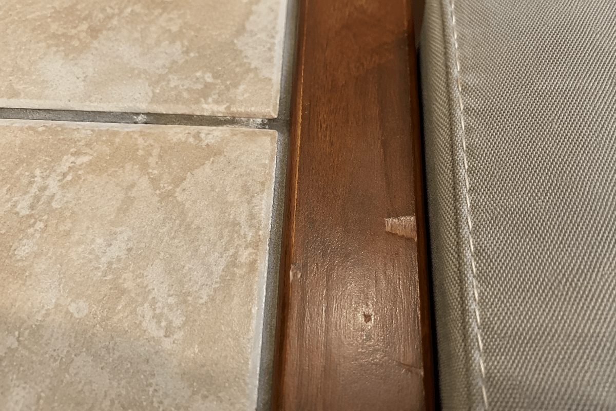
Mixed materials are unavoidable: grout plus tile, wood plus finish defects, fabric plus stitching. Treat these as multiple queries by segmenting patches, then combine results with a re-ranker; it costs compute and adds labeling effort, but it prevents one dominant cue from swamping the match.
Deploy and iterate: latency, privacy, and catalog updates
The moment this goes live, users judge it by waiting. If results take more than a second or two, they abandon, so use approximate nearest-neighbor indexes, cache frequent queries, and limit how many crops you run per photo on slow devices. If photos may include interiors or people, treat privacy as a product requirement: strip metadata, avoid storing raw uploads by default, and consider on-device embedding when policy or clients demand it.
Catalogs change, and embeddings go stale. Plan for re-indexing schedules, versioned models, and “new SKU” ingestion that doesn’t take days. Keep a small stream of flagged searches (bad matches, no matches) and review them weekly; fixes usually come from better reference photos, not a bigger model.